Reaction All Years

Genetic Affairs and The DNA Matching Suite

A quick glance at the AutoCluster tool used to visually represent your genetic relationships

Client Evert-Jan Blom
Professor(s) Leanne Seaward, David Lindsay
Program Computer Engineering Technology
Students Matthew Best, Arian Azizi, Ben Wynen, Matthew LeBlanc, Andrei Hesketh, & Jiayu Lin

Project Description:

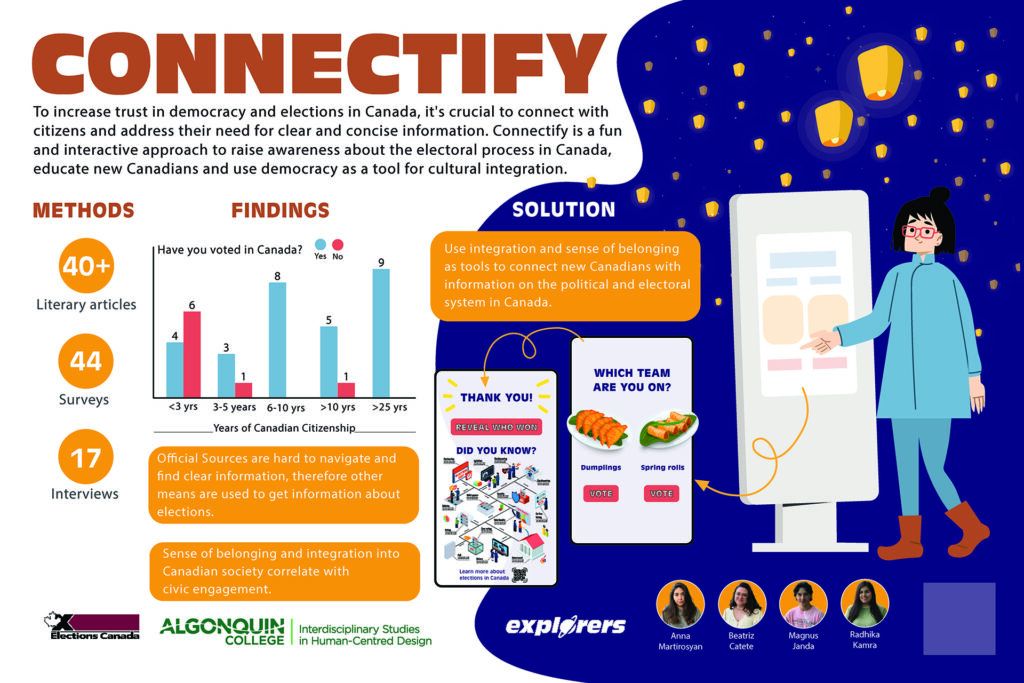
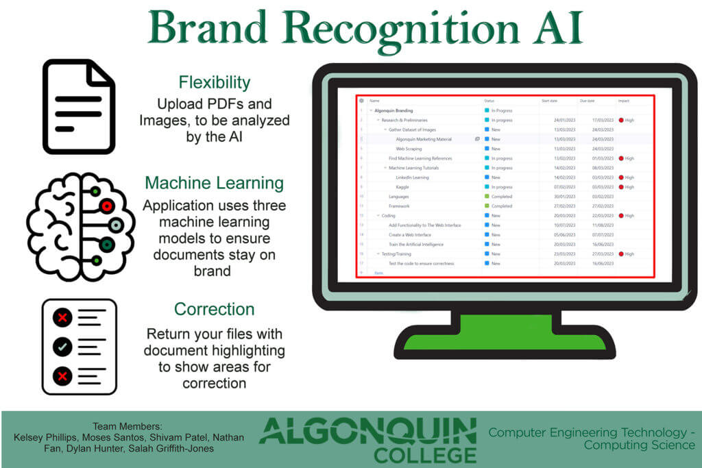
Genetic Affair’s front-end website was developed with the Vue framework and a JavaScript combination. The project encompasses a DNA relationship table to make comparisons off of, an AutoCluster diagram to give a visual representation of your genetic matches, and an Ancestral tree graph to allow you to explore your ancestry in more detail. One of the main purposes of Genetic Affair’s new website is to provide a user-friendly all-in-one resource that pools in your genetic matches and ancestry from multiple web sources.

Short Description:

Learn how Genetic Affairs is developing a front-end website where you can easily access and compare your DNA matches. Find out more about your ancestry by gathering from multiple ancestry websites in an all-in-one package!

Contact the Team

Video Presentation

Gallery

A visual representation of a user's DNA matches A table of genetic matches that summarizes the matches with numeric values
An ancestral tree graph that allows a user to explore their relationships in more detail A quick glance at our latest visual layout to represent Genetic Affair's website

Funded By

Breakfast Donation

Food Cupboard Fundraising

Client David Solomon
Professor(s) David Solomon,
Program Project Management
Students Estefania Camacho Oviedo
Gabriella Michetti Volpi
Kennedy Carneiro
Angela Londoño
Thais Barreto
Joseph Rizk

Project Description:

This project was planned to support the AC Food Cupboard and students who are experiencing food insecurity. The requirements are to raise $1,000 CAD with an initial investment of $40 CAD in a duration of 6 weeks, finalizing the project with the delivery of goods directly to Algonquin Food Cupboard on Friday July 29, 2022. The final proposal agreed upon by the team consisted of preparing boxes with a breakfast made up of pastries and coffee for two people. It was proposed the delivery of these boxes in a park, on this way, the people who wished could enjoy a morning picnic in the park. For reasons of quality and food safety, it was decided to buy the pastries, avoiding any issue of contamination. And after an arduous research and procurement by the team leader (Gabriella Michetti), two local companies in Ottawa agreed to donate products for the boxes, providing all the necessary products and equipment for serving coffee. With the help of these sponsors, the profit allocated for donation in each box increased, giving us the opportunity to have more margin. Through this project, it became clear that communication and procurement of stakeholders and sponsors, play an important role in the successful development of projects, marketing, and advertising is also required to make ourselves known, what is our project and why are we doing it. Finally, the skills of each member are added to be able to achieve the objectives. As final note, the funds raised were a total of 620CAD for procurement of goods.

Short Description:

Supporting AC Food Cupboard and Students who are experiencing food insecurity
•Breakfast kits to sell for pick-up
•Sponsored by local vendors
•Fundraising 60% of the goal through the selling of the boxes
•Amount raised: 620CAD

Contact the Team

Video Presentation

Gallery

Breakfast Box Happy Goat and Suzy Q Sponsored the donuts and coffee, cups and trays!
Pick up of the breakfast boxes in the park Pick up and Picnic in the park selected for delivery

Funded By

Smart Tenant

Smart Tenant -  Virtual poster

Client Smart Living Properties
Professor(s) Adesh Shah, Theodore Mirtchev
Program Mobile Application Design and Development
Students Team Lead: Kiet Vuong
UI/UX Designer: Kseniia Chornokondratenko
Full Stack Web Developer: Son Nhat Tran
Full Stack Mobile Developer: Evan Liko

Project Description:

We know moving is a stressful experience, and when you have to move, it means something important is happening in your life. What do you look for when choosing a place to live? Location, nearby amenities, quality of the building, but most importantly, it’s the community. The community is what makes you feel at home and what you can rely on during a crisis.

Our project charter was to create a mobile application and an admin portal for Smart Living Properties. The goal was to create an interactive and engaging cross-platform mobile application to expand their reach and engagement, as currently, Smart Living Properties has 200+ properties around Ottawa with thousands of tenants. It was paramount that the application focused on accessibility, inclusiveness, and a simplistic design to be usable by a wide range of users. With accessibility and inclusivity in mind, we also created an intuitive admin dashboard to facilitate content management and moderation for the mobile application.

The Algonquin College’s Data Analytics Centre, a team, composed of Kiet Vuong (Team Lead), Evan Liko (Mobile App Developer), Son Tran (Web Developer), and Kseniia Chornokondratenko (UI/UX Designer) started working with the goal of achieving the client’s vision. Throughout the project, we learned that constant communication and collaboration were essential for effective group functioning. Moreover, we used the GitHub project management tool to help alleviate stress, increase productivity, host our codebase, and meet deadlines. We also used Figma as a collaborative interface design tool in order to design our administration portal and mobile application.

With community, safety, and accessibility as our core values, the team and the client came up with the list of features that were essential for the product; some notable features are private messaging between tenants, moderation of Not Safe For Work (NSFW) content on the newsfeed and marketplace screens through the use of AI, managing tenants, and sending correspondence by leveraging Cloud Functions. For the front end, we use the most professional and trusted cross-platform technologies to date, React Native Expo and ReactJS, to ensure it looks just right on both the mobile devices and the web portal. We used Google’s Firebase services for secure and robust data storage and transmission for our backend. All our data is kept here in Canada.

With the project’s phase nearing an end, we can say that this was the biggest project we have all had the opportunity to work on. Although we faced many challenges along the way, it was an experience that deepened our knowledge of designing and developing the product on a large scale.

We want to express our gratitude to our stakeholders, Rowland Gordon, tenants and staff of Smart Living Properties, Algonquin College, and the Natural Sciences and Engineering Research Council for their support and for this wonderful opportunity to be part of the team.

Short Description:

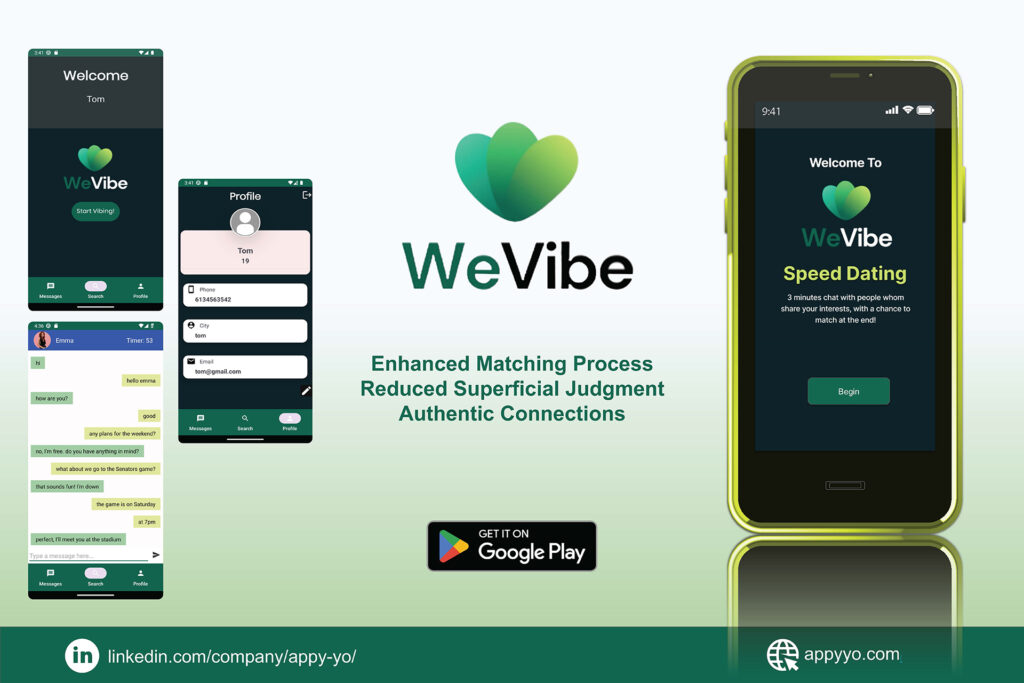
A mobile app for tenants of a property management company in Ottawa to connect with the local neighborhood, buy and sell items, get rewards and more.

Contact the Team

Video Presentation

Gallery

Admin Portal - Manage Tenants & Announcements Admin Portal - Manage Newsfeed & Marketplace
Admin Portal - Manage Buildings & Teams Mobile Application - Login screens
Mobile Application - Marketplace & Newsfeed screens Mobile Application - Notifications screens

Funded By

Giving Adults a Break Through Play

Our project is about Giving adults a break through play. Our client is Ingenium, Canada’s museums of science and innovation

Client Ingenium
Professor(s) Jed Looker, SuCheng Lee
Program Interdisciplinary Studies in Human-Centred Design
Students Bhuvan Bhanot, Mitra Bahmannia, Muhammad Khan, Rada Marza, Sara Hubberstey

Project Description:

This project began with Ingenium, the organization that runs Canada’s museums of science and innovation, reaching out to our class with a problem: due to COVID-19, Ingenium’s museums saw a decrease in visitors and the organization lacked alternative programming and services to reach out to Canadians virtually. We were challenged to conduct research to understand how Ingenium could expand its reach outside of physical museums, to not only reach people when museums cannot be visited, but also better fulfill the organization’s mandate to serve all Canadians beyond the pandemic.

Our team chose to focus on learning about how we can engage the age demographic of 18-35, which Ingenium outlined as a current gap in the demographics they serve. Inspired by Ingenium’s use of play in their museums and their mission of “unlocking the curious and creative minds of a nation of innovators”, we first set out to answer the following question:
Does play have a role in the lives of adults?

We conducted a literature review to understand play, the role of play in adulthood, popular experiences for adults, the role of play in museums, and adult perceptions of museums. The key findings were that there is no “true” definition for play, play is perceived to be for children despite the fact that adults do play, and that playful experiences can provide many benefits to adults like improving mental health, increasing creativity, improving problem-solving skills, and providing community to name a few.

Having found that play has a role in the lives of adults, it was now time for us to conduct our own research to find out what play means to adults, and how Ingenium can create a playful experience for them. We learned how to conduct a mixed methods study consisting of a questionnaire and semi-structured interviews. We used UX research practices to design, test, and iterate a questionnaire, which received 158 responses from a diverse range of participants. We then conducted 15 interviews to get a deeper understanding of the “why” of the questionnaire responses. Next, we organized all of the qualitative and quantitative data to conduct comparative analysis. After analysis, we developed insights and recommendations based on what we found in our research.

Through our study, we learned that our adult participants had very busy lives, and despite wanting to engage more in play, they often lacked time or energy. The platform we are developing helps adults take a quick break to play by giving them regular creative prompts, delivered in-browser or through SMS, social media, or email. Each prompt is designed to facilitate a low-stakes, engaging, and hopefully silly experience. Prompts are flexible—adults can do them alone or with others, in person or virtually, and through different sensory mediums.

Our platform will help adults play more while also fulfilling Ingenium’s mandate to reach across Canada. As adults interact with creative prompts, they will see their surroundings differently, moving towards Ingenium’s mission of unlocking curious and creative minds—with some laughter along the way.

Short Description:

After Ingenium approached us with a need to better reach Canadians virtually after the pandemic, our team looked to engage adults through play. We conducted research and developed a platform to give adults a break through short creative activities.

Contact the Team

Video Presentation

Gallery

Our project is about Giving adults a break through play. Our client is Ingenium, Canada’s museums of science and innovation Text: The team includes Mitra, Sara, Bhuvan, Rada, and Muhammad. Image: A collage of team portraits.
Text: The team wanted to help expand Ingenium’s online audience through play by first seeking to answer what play means to adults.  Image: A social media graphic that aims to recruit survey participants. A mix of findings, ranging from participant quotes to survey demographic information, that we used to inform our solution.
We visualized our research with a persona, experiences principles and a journey map. Our solution involves receiving a prompt on your phone that inspires creativity. For example, “Make a silly face out of your next meal!” Two Instagram post mockups show photos of food made in the shape of silly faces.

Funded By

Arduino-Based PLC

Electrical Circuits On A Printed Circuit Board

Client Michel Hanbury
Professor(s) Mauricio Ledon,
Program Electrical Engineering Technology
Students Muhammad Awais
Lianghong Gu
Hussein Taleb
Alexandre Aubin

Project Description:

The goal of the project is to replace the Festo Easy Port which displays the information from the 7 digital inputs, 5 digital outputs which use 24v, 4 analog inputs, and 2 analog outputs which use 10v from the Festo station.

Features:
HMI touch screen
Arduino Mega2560 microprocessor
Student designed PCB board
Arduino based programming
Custom 3D printed enclosure

Short Description:

Is a cost-effective PLC for Festo products such as the Festo station in CA219b. It integrates a microprocessor, a PCB, and an HMI in one.

Contact the Team

Video Presentation

Gallery

3D Enclosure HMI Screen View
HMI Control Features Nextion Screen Editor
Nextion View of Control Buttons

Funded By

Tales of ‘Genium

Canadian-looking landscape that has dark, hilly ground, evergreen trees and a colourful sunset. Centred is a man in a top hat and in the style of the late 1800’s, walking a bicycle. In the corner is a yellow tractor and in the air above, an airplane with title: Tales of 'Genium.

Client Ingenium Canada
Professor(s) Jed Looker, SuCheng Lee
Program Interdisciplinary Studies in Human Centred Design
Students Chiamaka Nwabuzor
Dilpreet Singh
Jennifer Poth

Project Description:

Overview: Ingenium Role-Playing Games RPG
The digital team of Ingenium, Canada’s national museums of science and innovation, have asked us to come up with an approach to engage Gen Z’s, 18-24 year olds, across Canada. This would be an approach that could be used across the 3 museums and across collections while being accessible to and inclusive of all Canadians of that demographic.

Solution Plan:
Ingenium museums would design role-playing games of different adventure-themed stories based around artefacts in their possession, gathering them in many contexts: eras, geographical regions, collections, technological progression, for example.

Adventure Planning
The manuals for campaigns, or main story arc, would be written by Ingenium historians/curators in collaboration with well-loved RPG authors. This would ensure that they are based on fact and history as much as possible in the set-up of adventures, but the storyline and game possibilities (including rules) would be designed by people experienced in role-playing games.
Playbooks, character sheets and other materials that define the game would be created and uploaded on Ingenium’s website as guides for users. The manual would include a quick guide with the basics as well as the in-depth story and rules. The sessions would be run on a messaging/sharing platform like Discord.

Genium Masters
Organizing and running the Campaigns (games) would be the Genium Master(s). They would run the (eventually automated) sign-ups on the Ingenium website and arrange the plan for the whole Adventure and each session. Sessions would be opened with the Genium Master framing the current section of the adventure and what the next steps are. Genium Masters could be curators of the museum or contracted professional Game Masters. As players become more engaged, they can become Game Masters.

Character Creation
Each player creates a character at the beginning of an Adventure with a Character Creation Guide. Users have the freedom to be whoever they want to be, so far as it fits the story. They do so by defining traits including interests, abilities and back stories. As this solution has as one of its mandates to be inclusive of all Gen Z throughout Canada, the character trait options will include diversity that represents the multiple cultures, different abilities, genders and other perspectives that are experienced throughout our country.

Character Avatars
Once the character is imagined, it can be depicted by the creation of a virtual character in a tool/app /platform with options to use their video & overlay IG (or Ingenium) filter on one’s own pic (like Snapchat) or build a completely new avatar.
Getting the Word Out
Posters/ads would be posted on Ingenium’s official social media accounts. IG, Facebook and Tiktok would be used for promotional purposes and to engage users in short interactive story hooks, polls, Q & A, and provide links and info on each RPG.
Campaign Booking
Users would click on story highlights in their social media and swipe up to read more on Ingenium’s website and sign up for the stories they are interested in the booking system maintained by the Genium Master(s).

Accessibility
Built into the solution would be aspects to meet and exceed Canadian and Ontario accessibility standards and be as inclusive of all abilities as possible.

Short Description:

To engage Gen Z across Canada in their online museum offerings, Ingenium would design and role-playing games (RPG) of different adventure-themed stories based around artefacts in their possession, set in historical, geographic, etc. settings.

Contact the Team

Video Presentation

Gallery

A collage of depictions of common traits of Gen Z.  Includes birthdates of 1997-2012, tech-savvy, using digital reach to promote activism, To reach them, we need to incorporate their peculiar sense of humour, short video, creative and visually appealing content, & a smooth user experience. Experience principles that guide the design of the solution: 1. Give context to facts 2. pique my interest quickly 3. Interactivity and and immersive experience is required 4. Choice 5. Spark my creativity 6. Inclusiveness 7. Make instructions clear and concise.
Try It Out Virtually. As part of our user interview process, we had users try out the 3 activities depicted: the Ingenium digital catalogue, the Rijksmuseum scavenger hunt and a Kandinsky AV experience. Promotional posters (3) for social media. 1st shows the landscape background of our main poster with an artefact displayed. 2nd, a mysterious mood with castles and viking ships lining a river. 4th, An astronaut, spaceship and alien floating in space.
The 1st 3 boxes of a storyboard showing the breakdown of the solution, including the subjects: Overview: Ingenium RPG, Adventure Planning, Genium Masters, and Character Creation. The 2nd 3 boxes of the storyboard showing the breakdown of the solution, including the subjects: Character Creation, Getting the Word Out, More Information and Campaign Booking

Funded By

Improving AskPolly — Bringing Human-Centered Design to Artificial Intelligence

AskPolly, Bringing Human-Centered Design to Artificial Intelligence

Client Advanced Symbolics Inc.
Professor(s) Jed Looker,
Program
Students Joyat Joseph
Muhammad Khan
Zhi Wang

Project Description:

Introduction to Project
AskPolly is a self-service tool for market research created by Advanced Symbolics Inc. (ASI) that uses artificial intelligence to study what people are saying online on social media. A person enters a query of what they want to measure (e.g. trucker protest), and the population they want to measure (e.g. residents of Ottawa). Polly then returns what conversations people are having online, how people feel about each of the conversations, and the demographics of the people. Though a powerful tool on the back-end, AskPolly’s engineering-first interface design was in need of improvement. ASI approached our team to research and design a new interface for AskPolly that makes the product easier and more intuitive to use.

Our Roles
Muhammad Khan: UX Research
Joyat Joseph: Interaction Design
Zhi Wang: Data Visualization

What We Did
We began the project by conducting a literature review and a heuristic evaluation of the current product. We also conducted interviews with engineers and augmented research managers at ASI to gain a better understanding of AskPolly and its function. We organized the information architecture of AskPolly and researched data visualization techniques that we could use to output information on a dashboard.
Using what we learned during our initial research we created a low-fidelity prototype using Figma that makes several changes to the original product to fill gaps in the user experience. First, we simplified the search page to have a single entry for a query, rather than having to manually add keywords one by one in separate entry boxes. We also added a loading screen, to improve the experience during the 5 minutes that it takes Polly to gather information for the dashboard. On the dashboard, we introduced a new card-based interface to make the conversations easy to digest. We also introduced simplified graphs to quickly provide users with an overview of the information related to the conversations they select. We also added functionality to add and remove graphs so that the user can customize the dashboard to their needs.

Next Steps
The next step of this project is design validation. We will be conducting usability testing on our design, and iterating it over 4 weeks to ensure that it truly meets the needs of users. During the tests, we will also be collecting important information on how users enter queries into AskPolly, which will be used to improve Polly’s ability to understand user inputs. Once we have a validated design, we will present a high-fidelity prototype and our research findings to Advanced Symbolics Inc. so that the engineering team can implement our recommendations.

We would like to thank the team at Advanced Symbolics and Jed Looker for the opportunity to work on this project and for all their help!

Short Description:

Our team at the Human-Centered Design Lab explored how we could improve the user experience of AskPolly, a self-service tool for market research powered by Artificial Intelligence.

Contact the Team

Video Presentation

Gallery

The team: Muhammad Khan, UX researcher; Joyat Joseph, Interaction Designer;  Steven Wang, Graphic Designer Entering location into AskPolly search page
Entering query into AskPolly search page AskPolly loading page
AskPolly Dashboard Usability Testing Instruments

Funded By

DocConnect

Image DocConnect logo and name on a white background. Blue circular logo with white outline of hand like a constellation to the left; "DocConnect" in large red font to the right. Below that, in smaller black font it says "It only takes a click"

Client Alek Golijanin
Professor(s) Karan Kalsi,
Program Computer Programming
Students Harpal Singh, Darshan Singh, Jaskaran Singh, Jamal Alkader, Sarah Cormack

Project Description:

The concept for DocConnect was developed by Alek Golijanin, a local community builder looking to make a difference in the lives of others, especially Canadian youth.
DocConnect is a web-based application designed to be used by high school guidance counselors to help students who do not have a family doctor. A postal code is entered, and DocConnect returns a list of nearby doctors and clinics. Necessary enrolment forms are also provided ready to print, to make the whole process as simple as possible.
This was a continuation of work previously begun by Algonquin College students in an earlier semester. There were some issues involving the initial set-up of the database account on the Firebase platform that were resulting in the DocConnect site being nonfunctional, so this was the highest priority. After resolving that issue, our work shifted to expanding the scope of DocConnect beyond Ottawa by increasing the number of cities represented in DocConnect’s search function, starting with Edmonton. This way, DocConnect could best fulfill our client’s goal of improving kids’ lives. Some alterations with made to the administrative, reflecting the expanded search scope in the database administration.
We also worked on finetuning the look and feel of DocConnect’s user interface to ensure a straightforward and effortless user experience.
Over the course of our work on DocConnect, several unexpected shifts in project requirements meant we had to be quick to adapt and flexible with our planning, pivoting between features as needed.

Short Description:

DocConnect is a web-based tool designed to help high school guidance counsellors connect Canadian youth without designated family doctors with medical clinics based on distance, as well as provide print-ready enrolment forms.

Contact the Team

Video Presentation

Gallery

The landing page of the DocConnect website in browser; the blue circle logo and title are in the top left. Below that it says " A family doctor is closer than you think..." with a grey "Begin" button below that. To the right, a close up of the side of a doctor holding a stethoscope The main page of the DocConnect website. A pale blue banner with the logo across the top. Below that, dark blue title, "Find Your Doctor." Below that, a pale blue search bar for a postal code and a blue "Search" button. A blue banner with info about printing forms. A graphic of medical professionals
Main page showing search results after entering an Ottawa postal code. To the left, a table of results showing doctors and their address, phone number, and distance from input. To the right, a google maps interface with some of the results marked A pop-up in browser showing the Patient Enrolment and Consent to Release Personal Health Information form ready to print
Results from entering a Edmonton postal code in DocConnect's test environment. To the left, a table with test data for Edmonton doctors' practices; to the right, a google maps interface showing the results marked with red icons

Funded By

PluralByte.com Website Design

Landing Page of PluralByte.com

Client PluralByte.com
Professor(s) Melissa Sienkiewicz, Islam Gomaa
Program CST 8334_Software Development Project
Students Abdulrahman Alhariri​
Qicai Liu
Gabriel Matte​
Jesse Okeya
Janice Omadto

Project Description:

The Team is working on website design using Angular, Node.js and NPM. The particular components asked for are revamped website with a more modern look, a live chat, chatbot features and database for user accounts storage.

Short Description:

The Team was tasked to revamped an old website and make it look modern and catchy. As well as integrate a chatbot with data persistence and intelligence.

Contact the Team

Video Presentation

Gallery

About Page of PluralByte.com Blog Page of PluralByte.com
sample Services Page of PluralByte.com sample Services Page of PluralByte.com
sample Services Page of PluralByte.com Sample Services Page of PluralByte.com

Funded By

COVID-19, Victim Services, and Well-being

Client Victim Service Providers
Professor(s) Benjamin Roebuck, Diana McGlinchey
Program Victimology
Students Areeba Ahmad
Eloina Rodriguez Petrova
Aisling Mccoy
Maryanne Kamunya

Project Description:

“The pandemic has made my job more difficult. When the courts closed, our case numbers doubled because cases were not being resolved… It has become more challenging to stay mentally well during the pandemic, as some of my strategies for self-care were thwarted.” (Victim Service Provider)

Stay-at-home orders in response to the COVID-19 pandemic changed the delivery of victim services, increasing the challenges for service providers to support victims and survivors of crime. We were interested in further exploring this topic by answering the following questions in a paper for the Department of Justice:

1. How have pandemic restrictions related to COVID-19 affected the delivery of victim services?
2. How have these workplace changes affected service providers?
3. How has the COVID-19 pandemic impacted the overall well-being of victim service providers?

In our national survey of 564 service providers across Canada, respondents indicated an increase in workload and that the need to adapt to shifting public health guidelines generated additional stress. Service providers shared different perspectives on how they had been affected by working from home, with some finding it more flexible because the work happened in their own positive space, while others found it more difficult because they felt the work was invading safe spaces in their own homes. The majority of participants working full-time or part-time indicated spending more time working from home during the pandemic. Approximately three in ten service providers who reported these increases also reported a decrease in their work-life balance and 42% reported that their overall mental health had decreased as a result of these changes. More than seven in ten reported that their level of stress had increased. These findings suggest the need for flexible and diverse approaches to service delivery after the pandemic. Greater choices should be available for both victim service providers and survivors about aspects of services that are best suited to meet their needs. Additionally, the increased use of technology has introduced the possibility of survivors meeting with victim service providers or participating in the criminal justice system virtually. For some, this offers a safer and more inclusive service environment, which is worth retaining post-pandemic. However, it also introduces barriers for those without access to technology. Service providers felt that virtual services introduced additional barriers for survivors without access to technology, while providing others with safer and more inclusive access to support. Findings also highlighted a disparity in the resources and compensation available to service providers working in different sub-sectors of victim services. This study also suggests the need for increased and on-going financial support to ensure that victim service organizations are equipped to meet the needs of their clients.

Short Description:

COVID-19 transformed victim services, increasing challenges for service providers to support victims and survivors of crime. Join us as we consider findings from our national survey regarding the experiences of service providers in the pandemic.

Contact the Team

Video Presentation

Gallery

Research Questions Our Methods
Our Findings Impact of COVID-19 on work and wellness
Impact of COVID-19 on work-life balance Impact of COVID-19 on mental health

Funded By