In-person Poster Guidelines
Poster Design
To save time, it is recommended that participating teams use the same poster design for the virtual project page. Posters should have the following elements:
- Title – short and explanatory
- Authors – full names of all author, as well as program of study
- Abstract – No more than 50 words
- Author Contact Information – contact info for one author
- Funding/Project Partners (with logos if possible, see examples below)
Preparing your poster for print
- The final version should be PDF scaled to fit the poster dimension, to make things easier for the Print Shop. See dimensions below.
- Your poster must be one single page, and must fit on a 16”H x 24”W (300 dpi) display board.
- Your poster will come with a stand. It must be displayed on your table.
Fonts
- For best results, use no more than 1 or 2 fonts.
- Use at least 96 point font for the title, and at least 48 point font for subheadings.
- No fonts should be smaller than 36 point.
- Don’t overuse text – A good image and a few bullet points will be far better than several paragraphs.
Colours
- Try to use only a few colours
- A white background is preferred; If using a dark-coloured background, ensure the text colour has enough contrast to maintain legibility.
Images
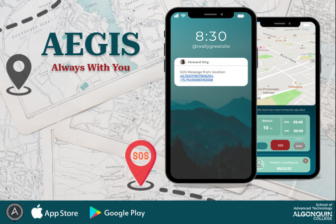
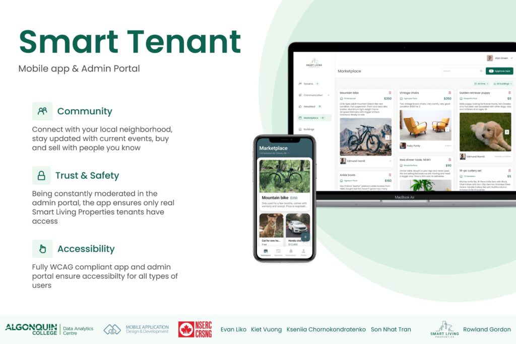
- Consider using a single large image that showcases your work. See examples below.
- You must include Algonquin College’s logo. See Algonquin College Logos & Branding Guidelines.
- If your project is funded through the Office of Applied Research, please use the Applied Research logo.


