Update to the widget display selector
Posted on Tuesday, November 6th, 2018
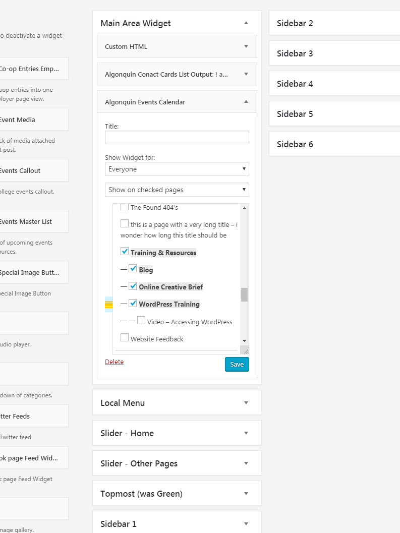
You may notice when working with widgets that there’s a few design changes to the page/post selection box.
One of the changes can be seen in the example below:
- The orange lines on the left represent where your selections are relative to visible area of the list – which is represented by the blue box.
This should help you locate the current selections even when they’re not currently visible on screen.

- Posted in
- Website Tutorials wordpress